MyEcho Printing
Festival Branding | Logo | Colours | Stationary | Advertisement
Adobe Illustrator | Indesign | Photoshop
MyEcho Printing is a branding project for a small printshop. I started from developing the concept and goal of the printshop and designing the digital/print marketing, social, web and festival promotional assets required including the festival name, logo, colours, landing page and merchandise.
It is a printshop that specialize in individual, and customized prints on various materials. To provide easy steps to print any individual designs to mass corporate materials in the concept of “Echo your footprints in your life.”
Research
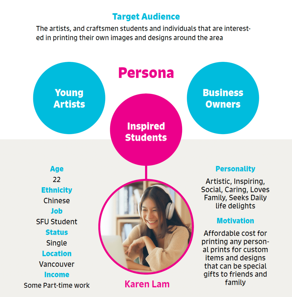
The location of the printshop, Hasting Sunrise is A slowly growing neighbourhood with diverse community with many immigrants in age 40-50, especially the Chinese (Cantonese-speaking) population that has been living in the area for a long. However the newcomers to the area are mostly in 20-30 age, current professionals in the working class. Based on the research, I created these target audiences and persona for the design.
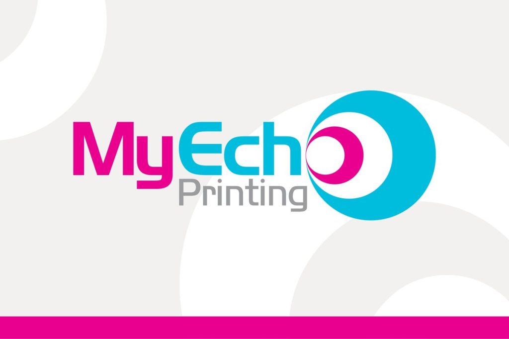
Logo
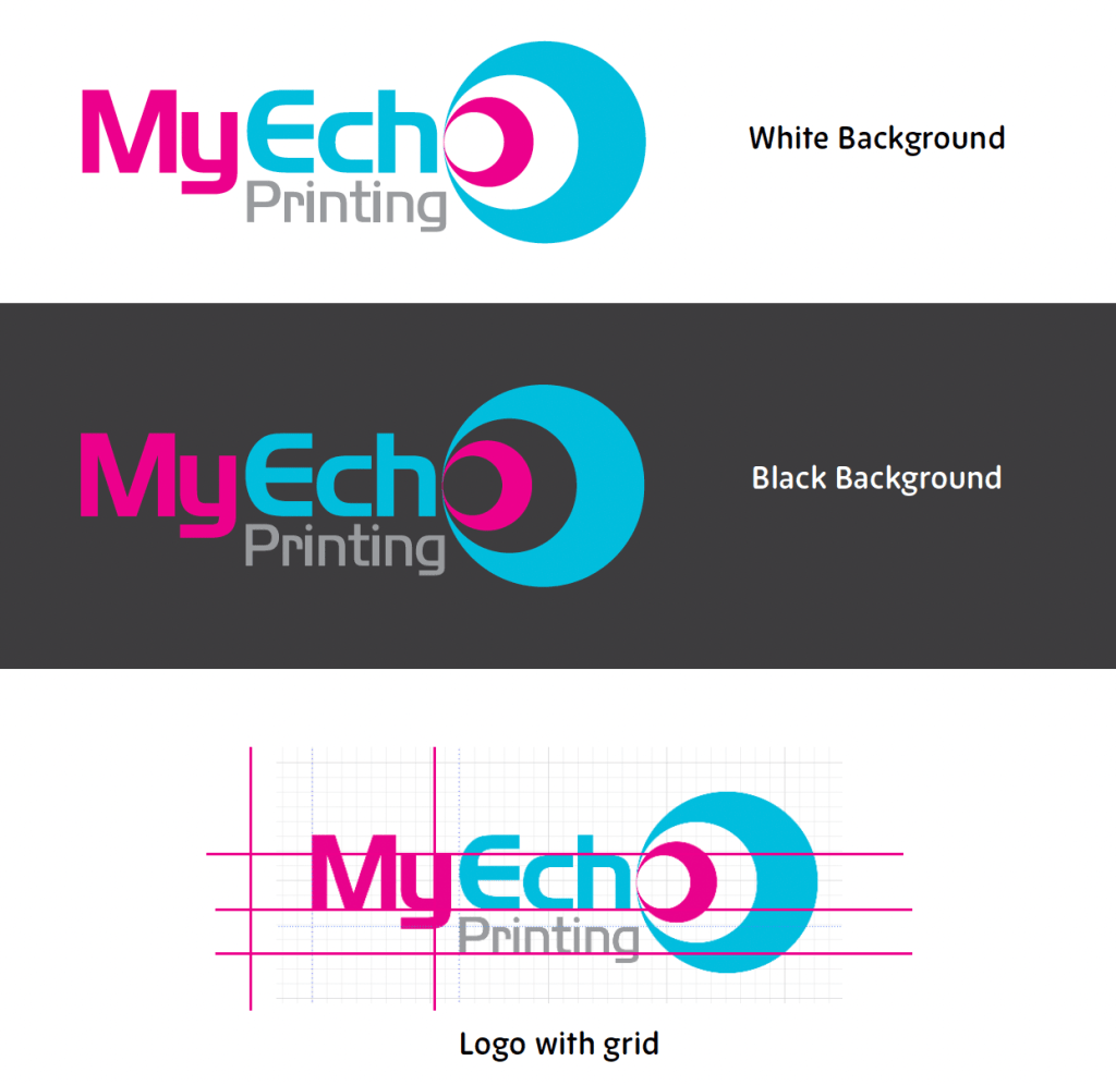

The logo is designed so it is easy to read with separation of each word of pronounciation by colour. The type chosen is technical, geometric yet simple and friendy with the semi-rounded shape.
The highlight of the logo is the “o” that takes the form of the spreading “Echo” representing the brand
Colours & Typography
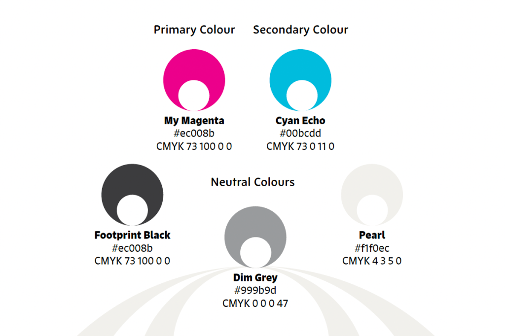
Cyan and magenta are the first colours of cmyk colours often used in printing. It also creates a cold to warm colour contrast that draws eyes. Magenta represents harmony and friendliness and emotional, while the cyan blue colour confidence, technical and energy The Neutral palette has three different shades of grey, which easily balances out the contrast warm ivory is the lightest colour isntead of the pure white, bringing the comfortable feel and warmness.Both the primary and secondary typeface chosen are playful Sans serifs with some different characteristics.Signo has playful strokes that vary in its thickness. It has an active touch that makes it great for titles and subtitles while keeping the versatility also a tall x-height which makes the body texts also easy to read.New Zen is an adaptive and flexible sans serif family that has round, simple characteristics. It has both friendliness and professional touch through the round, playful shape and modern, consistent form of the type.

Cyan and magenta are the first colours of cmyk colours often used in printing. It also creates a cold to warm colour contrast that draws eyes. Magenta represents harmony and friendliness and emotional, while the cyan blue colour confidence, technical and energy The Neutral palette has three different shades of grey, which easily balances out the contrast warm ivory is the lightest colour isntead of the pure white, bringing the comfortable feel and warmness.
Both the primary and secondary typeface chosen are playful Sans serifs with some different characteristics.
Signo has playful strokes that vary in its thickness. It has an active touch that makes it great for titles and subtitles while keeping the versatility also a tall x-height which makes the body texts also easy to read.
New Zen is an adaptive and flexible sans serif family that has round, simple characteristics. It has both friendliness and professional touch through the round, playful shape and modern, consistent form of the type.
Stationary
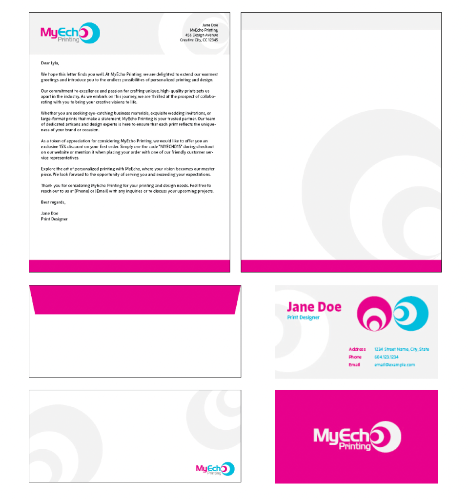
There are some stationary designs for the brand to use. They are mostly kept simple, yet not necessarily static using the brand’s unique graphic elements and colours.
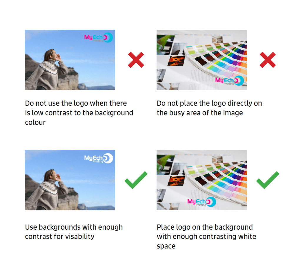
Advertisment
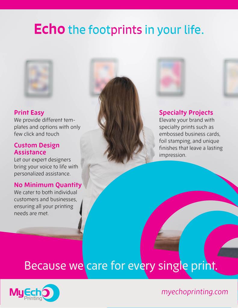
Advertisement is designed upon following all other brand identity created. The general image style contain warm and bright colours and friendly nostalgic and welcoming visuals, while blending in with the strong primary and secondary colours.
