Herstory
Festival Branding | Logo | Merchandise | Advertisement
Adobe Illustrator | Indesign | Photoshop
The HERStory Music Festival was an individual academic project about a female-centered hip-hop festival. I started by developing the concept and designing the digital/print marketing, social, web and festival promotional assets required including the festival name, logo, colours, landing page and merchandise.
Hip-hop originated as a movement of self-expression and response to social and political issues. As a previously male-dominant genre, many female hip-hop artists have emerged and also arose into counterattack historically. The name HERstory refers to a feminist perspective on history, emphasizing women’s experiences and the counterculture of hip-hop.
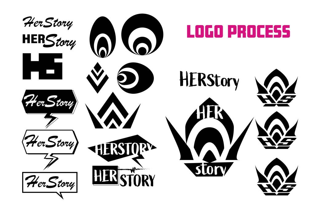
Logo
The logo conceptualizes the letters “HS” short for HERStory into the shape of a crown symbolizing the power and the voice spreading out like a flame. Hip-hop sparked as a movement that expresses self, dream, and freedom as a counterculture. Additionally, this logo is also used as a graphical element and patterns used across the marketing assets including posters and merchandise.
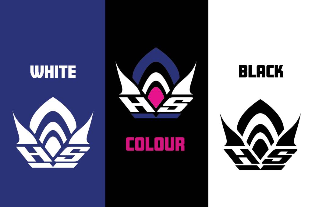

Colours

The primary colour- magenta, symbolizes empowerment, courage, and breaking through barriers –whereas pink qualities are often associated with strong female voices. Bright, contrasted colours show the movement and power of hip-hop, while navy adds depth and sophistication. The warm colour tone infuses positivity and a sense of summer. Collectively, these colours reflect the festival’s themes of creativity, unity, excitement, and community.
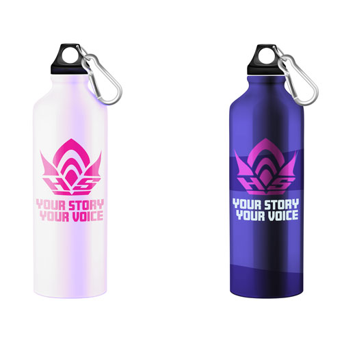
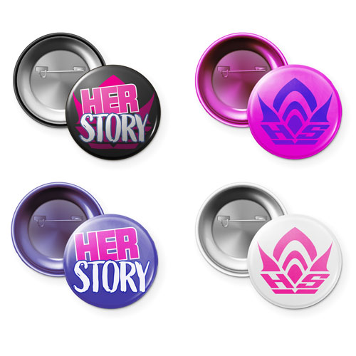
Merchandise
The pattern used on the merchandise is created based on the logo graphics.


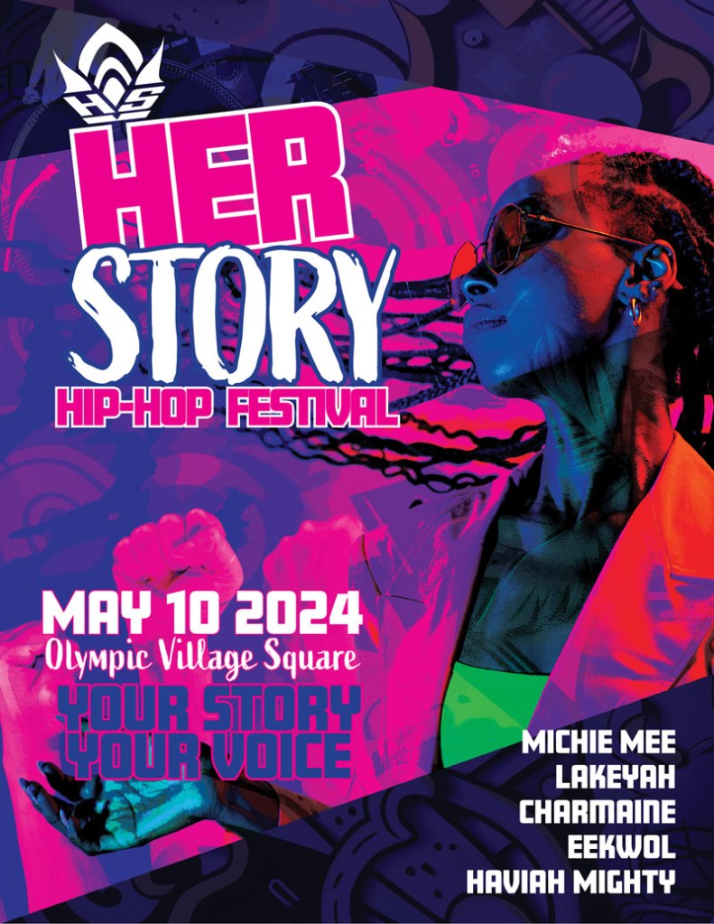
Advertisment
The large, bold sans-serif type creates a strong impact. The slight tilt and the use of different typefaces within the title are used to create tension.
